30 May 2018
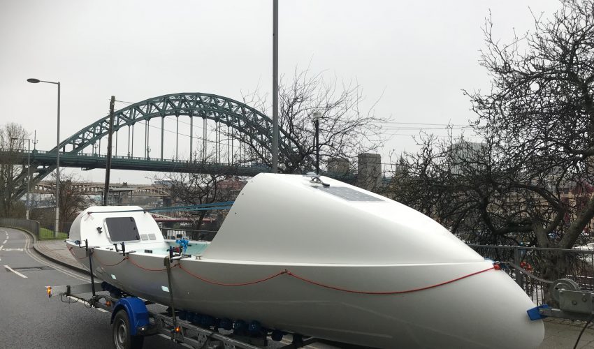
Newcastle College Students create outstanding designs for our Atlantic Boat
One of the key objectives of our Atlantic challenge is to showcase the North East and in particular the innovation generated from our businesses, colleges and universities.
In looking to achieve this we asked Newcastle College if its Students would design the look of the boat and were delighted when the 1st year Textiles students accepted the challenge. They went on to created some really bright and exciting patterns based primarily on their research around innovation in the North East. This has included visits to the quayside, Castle Keep, Sunderland Glass centre and the Lit. and Phil to name a few.
One of the designs will be chosen by Team Tyne Innovation and ultimately find its way onto the boat, with our sponsors logos. The boat will then be showcased around the region.
Below in no particular order are the designs generated by the talented students.
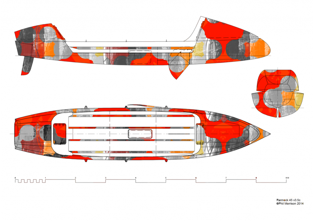
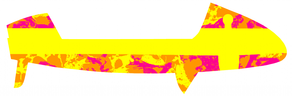
Deb Helme
I have chosen this design for the boat wrap as I feel it embodies the principle requirements of the brief:
The boat needs to be seen – this yellow certainly isn’t mellow! The complimentary colours were inspired by the marketing palette used by the Great Exhibition of the North. I felt this was the best colour choice for visibility. Both from a safety at sea – Yellow is noticeable in all weather conditions – rain or shine, and secondly from a marketing perspective. This bright yellow pattern will always stand out in a crowd. Colour choice is integral to a successful design.
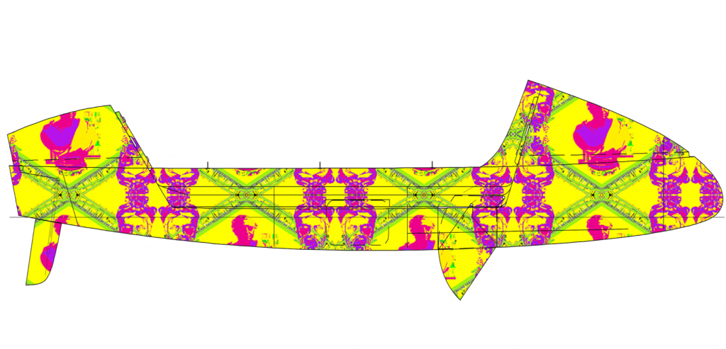 The second consideration was Northern Innovation. I could have created a pattern from more obvious northern landmarks, but I chose my motifs to tell some of the story of Robert Stephenson, a local man who is considered the greatest engineer of the 19th Century, the green grid pattern within the design is made up of sections of the High-Level Bridge which is considered the most notable historical engineering work in the city. The design is finished with a mirror repeat of 4 Tyne River gods at the out corners of the bridge sections. I see this figurehead as a good luck talisman and feel this local emblem and striking motif will make for a great conversation starter for curious observers of this bold design.
Finally, the design in itself is a northern innovation, this bold design stands out from the crowd. From a distance you see bold pattern, but on closer inspection there is a story within the imagery. The boat will appear wrapped in the brightest of traditional inspired wallpapers – not a concept I have seen on a boat before!
The Challenge is no average day’s row, why look ordinary when you could stand out and look Extraordinary?
Additional Considerations:
The green cross bridge sections could be constructed from a reflective material that allows the boat to literally glow in the dark. The sponsor logos could be mounted on the same bright but plain and pattern free yellow rectangular backgrounds to allow them to pop free from the pattern and be easily read.
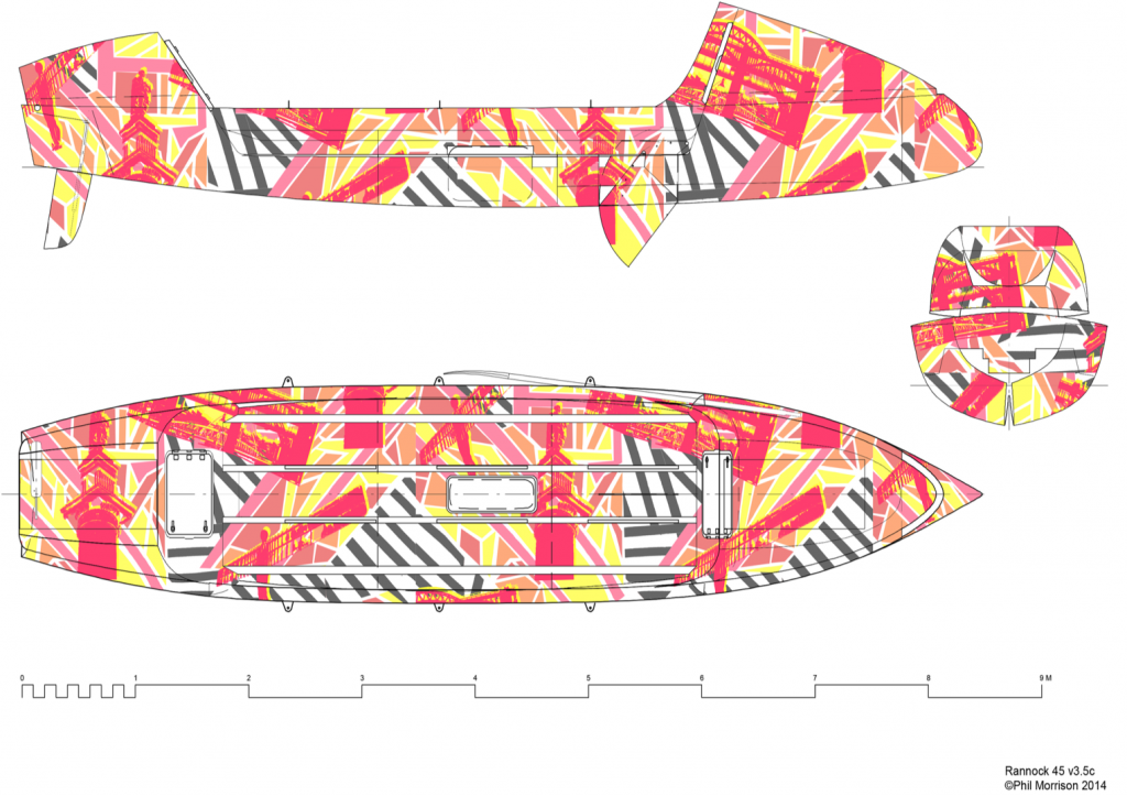
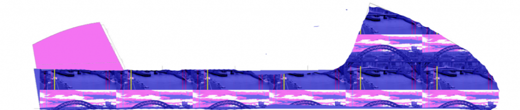
Steph Pinnock
My overall inspiration in developing this design came from The National Glass Centre in Sunderland which is a key element in North East history, bringing together religious, social and industrial heritage.
Sunderland has always had a rich glassmaking heritage and played an important role in the industrial landscape of the city. Since the industrial decline the National Glass Centre has been dedicated to continuing the North East legacy of glassmaking.
 I visited the National Glass centre and observed a plethora of elegant, intricate, ornamental pieces of glass. From this primary research I explored drawing and painting from which I digitally created my mirror repeat pattern.
My intention is that my work will inspire all those involved to continue to highlight the world leading innovation that exists in the North East of England.
Danielle Scott
Inspired by innovation in the North East, I have designed this print. It shows covalent bonds (water) made up of the Center for Life, as humans are 70% water, and the Centre is arguably one of the most innovative buildings in the North East. I have made this print bright so it would stand out during the daytime but reflective strips could be added around the motifs to add another security feature.
The print can be scaled down or the logos could be added in white to make them stand out but still allows the print to be seen.
Catlin Bray
I had done a lot of research into Dazzle Ships/Camouflage used throughout World War 1 and I was really drawn to the bold, geometric shapes and complex patterns used in contrasting colours which was something that I wanted to explore more of.
My colour palette was inspired by the images I took from along The Ouseburn, a place that has gone from post-industrial wasteland to Newcastle’s foremost cultural and creative quarter! I chose this design as my final because it’s something you definitely wont be able to miss! And although very busy and in your face, it shows a lot of Northern Innovation as well as a back story of being dazzle ship inspired.
The bold thick stripes in the background completely uplift the whole design and the layering of the obvious motifs of The Angel of the North, Greys Monument and 4 of the most iconic bridges on top of a more abstract drawing of the Tyne Bridge merge together really well and allow space for the sponsors logos.
Jo Stanley
North East innovation, past and present, is the main staple of my design for the boat. Having spent many an hour in Newcastle’s Discovery Museum it became apparent that our region had such a rich and varied history of innovation it would be a crime not to showcase some of the individuals or their inventions which have helped to put us on the map and ultimately change the world.
The scale of the image pattern allows for the sponsor logos to be placed anywhere without interfering with the narrative of my design – where an image may be covered in one area the repeat allows it to be seen elsewhere.
Combining this imagery with bold, abstract original artwork ensures that the vessel will always be seen and the addition of reflective strips add an extra safety element.
Megan Gough
As a surface pattern designer I am big on my bold prints so this was a perfect way to let my creative juices flow, my usual style of work is very pristine and stylised, always vibrant and usually quite geometric and abstract.
My thought process behind my designs was the idea of provoking thought. I wanted to create a print that would interest people, to be eye-catching and for people to question the narrative behind it. When I think of innovation in the North East and Newcastle I first thought of the bridges, the Millennium bridge, the Tyne bridge and the High-Level bridge. As a class full of textile students/surface pattern designers that were given the same brief I knew that a great deal of us would have the same idea to incorporate the bridges, I wanted to to avoid the cliché bridge motifs and instead incorporate them into a pattern where they aren’t as obvious.
As for my colour palette with the boat sailing the Atlantic Ocean it was evident that I should steer clear from dark colours including blue and green tones. When being briefed bright and vibrant colours were paramount as this would allow for the boat to stand out from others. Throughout the journey of my work a lot of my prints included pinks, reds, yellows and oranges, all warm and dazzling colours. I feel that my design reflects the narrative I wanted and I feel my design is successful in regards to the brief we were given.
Adrianna Malegowska
I had to consider many factors when designing this print a few of which were: the use of colour and how it affects the heat in the boat, how to make it noticeable in the ocean and most importantly how to make it personal to the team. Therefore decided to go forward with the brightest colours and focus on the theme of the North East.
The print it self, is a digitally edited photograph of pebbles, took by the Tynemouth Rowing Club. The overlaying Angel of the North wrapped around the boat would be made of a reflective material and represent a guardian for the team in case of any troubles they may face.
Ellie Hall
I got my inspiration for my designs by using my research that I did on the dazzle ships from the WW1, I used this with the block shapes that I put in to my design as well as the repeat pattern as when I looked they used the same shapes on the boats by repeating them. I also used some designers that I found that create digital
Repeat patterns which helped me come up with the colours that I used in my design. I got them colours by playing around with my own images that I took and changing the hue around, I thought these colours worked well together
As they would stand out at sea and they represent male and female in the simplest way, and a yellow as a gender Neutral colour.
Hannah Mountain
From my initial research I decided to focus on the detail of the bridges from Newcastle. The metal beams I turned into stripes of colour. Looking to Rio Carnival for colour inspiration as I wanted the trip to have a celebratory feel. My final piece is created from a simple painting, which I then altered in Photoshop to create a decorative pattern.
The colours and design are neutral for both sexes of the team. Although I made the design bright and fun, I didn’t make it too overbearing as the team would have to spend a lot of time with the design. I created a repetitive pattern so the placement of sponsor’s logos wouldn’t be a concern to changing the design.
Rebecca Mill-run